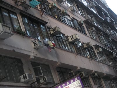
One thing I always associate with Asian cities is density. Density of people, sights, buildings, activity, shops, advertising - all sorts of density. And each city has its own particular type of density. For me, this is Hong Kong's:
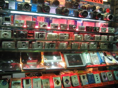
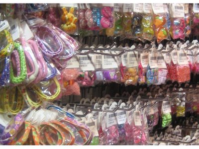
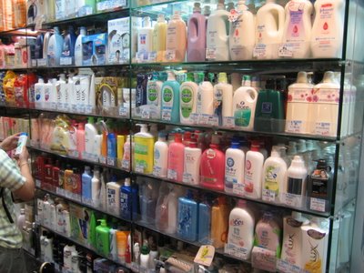
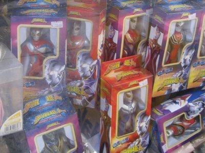
even extra dense characters;

Thought of the day: How does this particular sort of density affect people and brands?


9 comments:
Even Chinese language websites are dense, check ou www.qq.com or www.sina.com.
Now that I think of it, those pictures might just be a retailing thing where they want to maximize revenue/amount of shelf space.
But in general, I think this density means that consumers are really good at filtering out the noise and it means brands have to compete harder for attention and dollars.
Smaller competitors get wedged out, leaving a handful of brands dominate. Even amongst these brands, the competition is so tough that I think their marketing departments are focused on sales and market share and not brand identity. A CD who works in Shanghai told me that marketing managers get canned every two years over there so they just focus on short term gains. When it comes to advertising, it may just be an endorsement from the current hot celebrity.
But I think everything I said does not apply to luxury goods or foreign brands. Those guys cheat. =)
Haha, check out my comment, it's pretty dense.
seems quite overwhelming, the kind of environment where our @blink' like "thin-slicing" needs to work that bit harder?
are there examples of where 'space' has been preserved away from commercial interest? public spaces or 'open' commercial spaces to just slow people down, give them a sense of well, 'space', to think, to relax.
playing with the sense of space - be it media space [using lots of "white space" etc] to shelf space etc may be one way to actually gain some brand awareness. That is, if people value 'space' at all, if they feel compacted by the 'denity' of life...
Nien, absolutely. I think people cope by filtering out the noise, or setting up new criteria which rapidly simplify - walk into any shop in HK and they'll immediately offer you 'the latest' - cutting through all options easily. And counter to that, people scrutinise (note lady at edge of frame looking at shampoo), looking hard to ascertain difference and quality on personal grounds.
James, thank you, for crystalising this, that is exactly what is offered at the mall! They offer simplified and decompressed spaces. If you examine their interiors they are actually an interior park - fountains, children playing, shows (bandstand style), perambulation, sometimes even real greenery! And shops just add to the fun. A park with shopping. Perfect!
Actually another thought here: i meant density to be a completely objective and non-judgmental term. I wonder if aesthetics can vary about it. Density can be bad for some but what if it suggests abundance to others?
That definitely the way it felt when I was in Hong Kong. Though when you get out to the New Territories it suddenly changes in many respects.
Where was the symbols from? Reminds me of the MTR signs for some reason (I dont speak or read Chinese...!)
Hi Rob, you're right its from Causeway Bay MTR. It's a bit of cheat as HK now uses simplified script (sames as PRC) but they used traditional,more complicated characters til fairly recently so I'm claiming artistic license to include these characters...
Wow, im really impressed I got that, considering the only symbols I know are the those for Exit!
Just proves that being in a place is the best way to learn a language!
Here are some links that I believe will be interested
I'm impressed with your site, very nice graphics!
»
Post a Comment