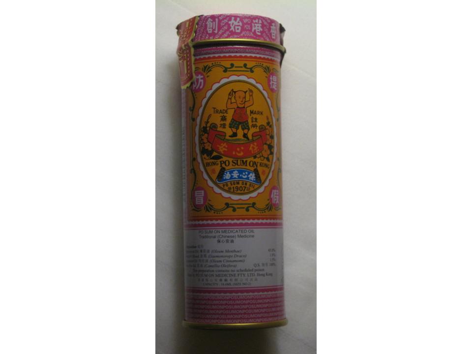
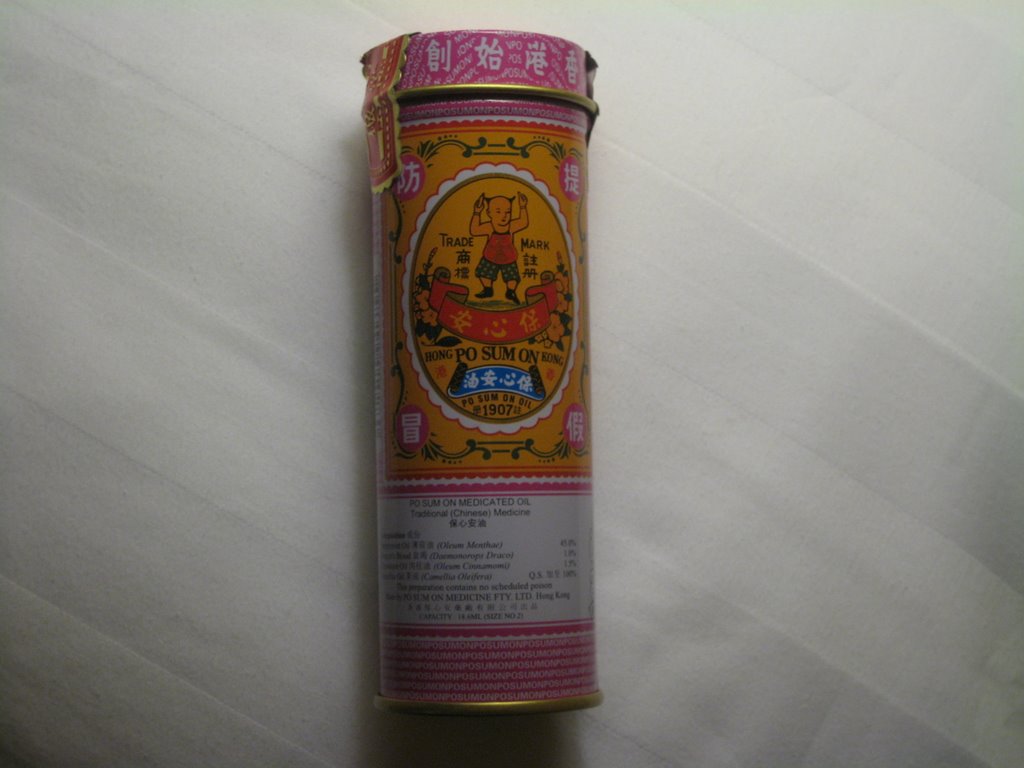
 Traditional Chinese ointment packaging usually includes a portrait of founder, Po Sum is no exception:

Even though the founder was Nosferatu...
 Actually that's a cheap shot as I do like his photo as he looks so jolly - the founder photos are usually a little somber, and closer to a funeral headstone or stele photo rather than one that makes you feel like you are in good medicinal hands.
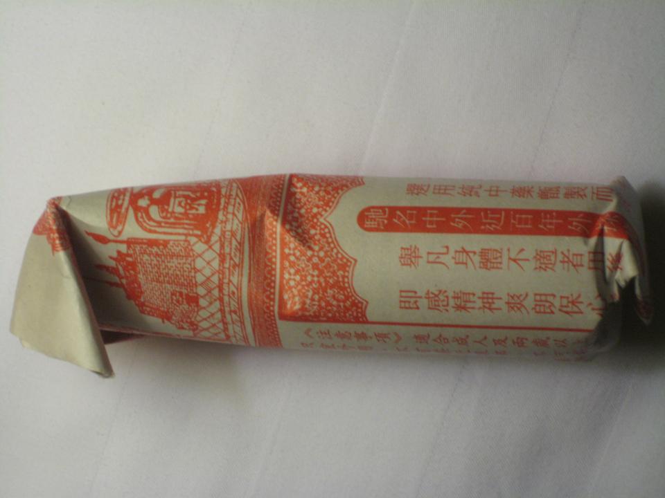
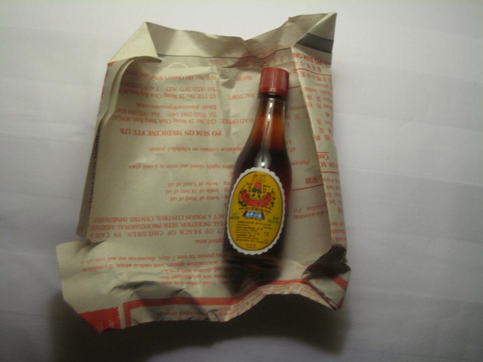
And look at the accompanying product information sheet, a work of art.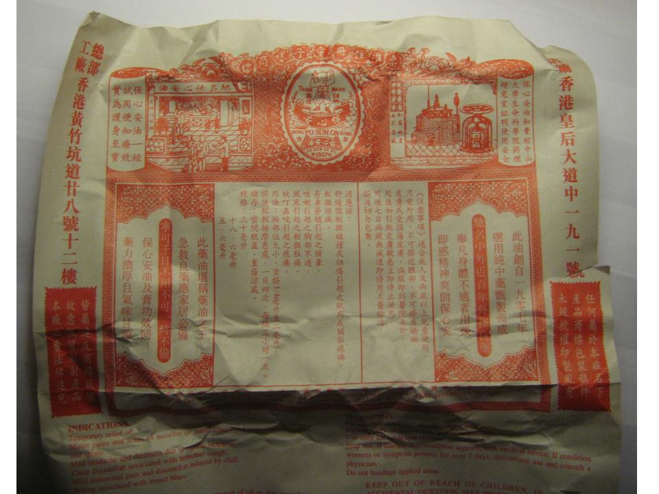 and finally the actual bottle.
But there are quite a number of 'heritage' ointment brands and just look at the on-shelf effect...
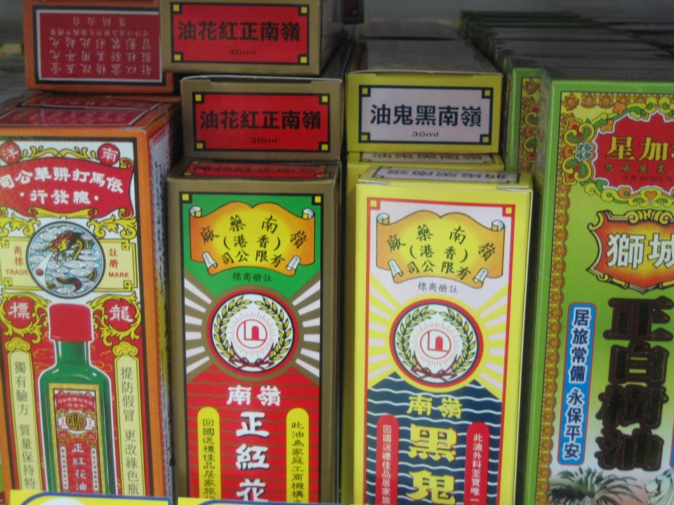
Makes you look forward to pulling a muscle.
This 'White flower ointment' is looking quite plain in comparision but the whole box is only the size of a postage stamp. And its embossed, which is a really nice touch.

1 comment:
Your are Excellent. And so is your site! Keep up the good work. Bookmarked.
»
Post a Comment